Start Page
When you click > Reviews, the start page of the module is shown:
Note
The start page is a dashboard that is customized to your company's requirements. It will probably differ from the start pages shown here.
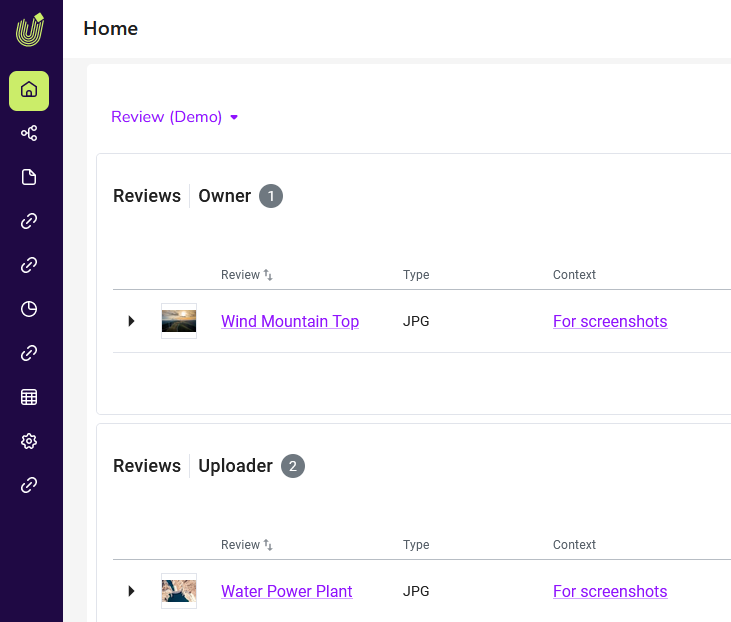
The dashboard shows various widgets, usually one widget per role (owner, reviewer, guest and uploader). The widgets list the reviews in which you are involved in the respective role. The reviews can be filtered according to their status using a filter. The following screenshot shows a review in which the user is the owner. The review is running, but no reviewers have been added yet.
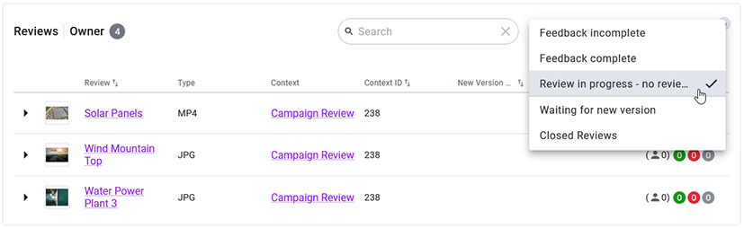
A detailed description of the available filters can be found in Find and Open Review.
 Structure of the Widgets
Use the search bar at the top of the widget to search for a review in a long list.
If you click the arrow on the left in the row of a review, a larger preview image of the review is shown:

When expanded, you will see the Open review buttons and, if the status of the review and your role allow it, voting buttons for directly rejecting or approving the review.
The following properties are always listed for a review in the widget table:
|
Column |
Description |
|---|---|
|
Preview image of the asset |
— |
|
Review |
Name of the review |
The following properties can also be shown:
|
Column |
Description |
Visible in Table by Default |
|---|---|---|
|
Votes |
Status of the participants' votes |
Yes |
|
Due Date |
Date by which the review should be completed. |
Yes |
|
Context |
Context in which the review was created, e.g. job name. |
Yes |
|
Context ID |
Context in which the review was created, e.g. job ID. |
Yes |
|
Last modification date |
Date on which the review was last edited |
|
|
Review ID |
ID of the review |
|
|
Start date |
Date on which the review was created |
|
|
Status |
Status of the review |
|
|
Type |
Type of the asset |
Yes |
|
Date by which the uploader must deliver the new version at the latest. This deadline is set by the owner when the owner requests a new version. |
Yes |
To decide which properties are shown, click the  icon on the right above the table. The following menu is shown:
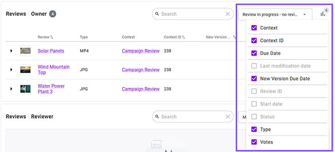
The number of properties currently displayed in the widget is determined by the number in the icon. Once you have clicked on the icon, a list of all properties is shown. Activate the checkboxes for the properties you want to show in the widget. Note that a maximum of 6 properties can be shown. Therefore, first deactivate the properties that you want to hide.
You can also change the order of the columns using drag-and-drop. To do this, place the cursor on the header cell of the column you want to move. Drag the cell to the area in which you want to place the column.
You can use columns with the  symbol to sort the table in ascending or descending order. The column with the
  (descending) or
  (ascending) symbol currently determines the sorting of the table in the respective direction.
Each user can customize the optimal settings of the table for themselves and their own needs.